Onmed wasn’t a screen-design problem — it was a complexity problem. The project required understanding healthcare context, government-facing material, user expectations, and operational constraints before any design execution could start.
My work focused on discovery and definition: decoding the material, identifying user needs, mapping the experience, and shaping a design strategy that could guide the product forward.
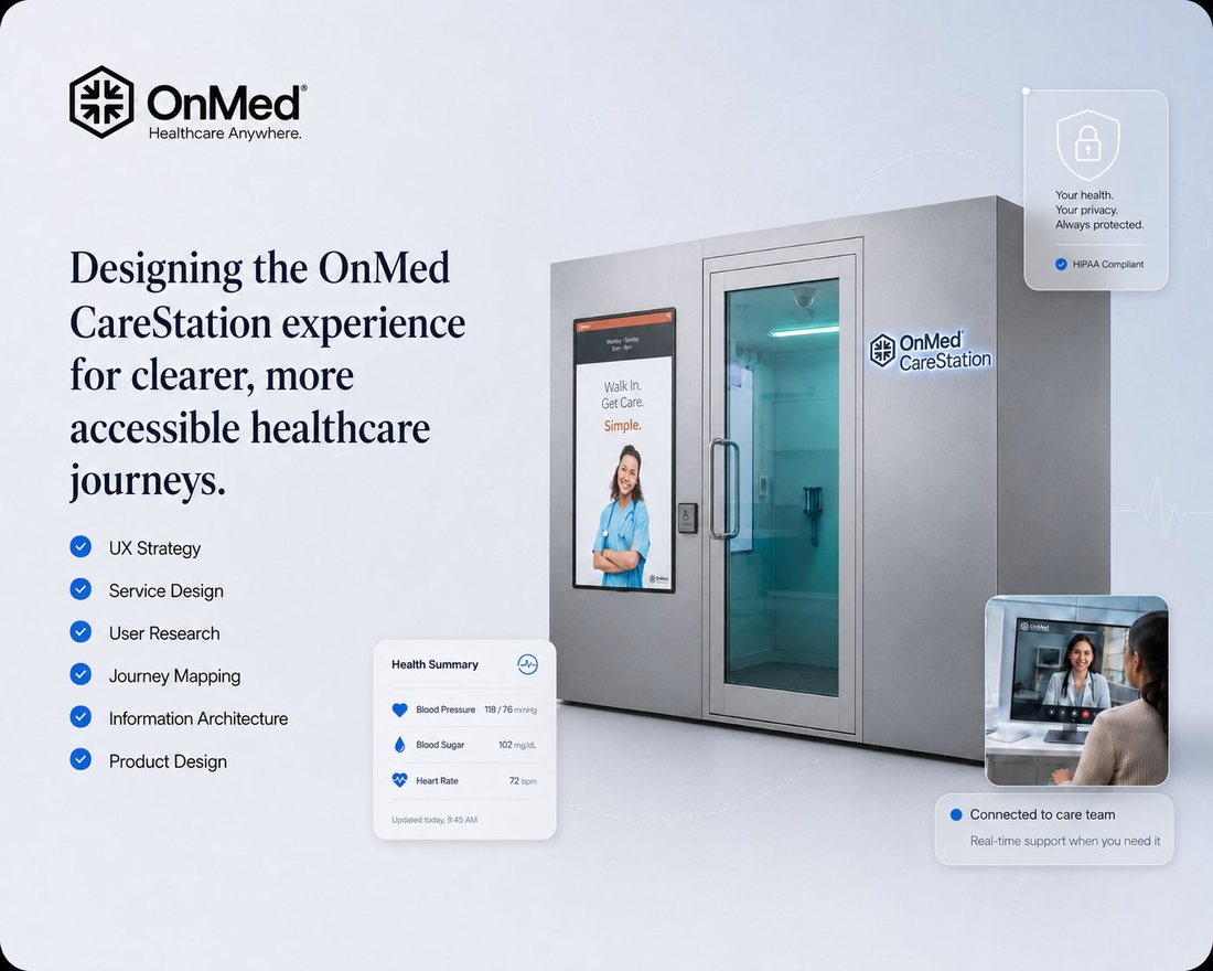
Onmed — hero visual
The challenge
- The source material was dense and not remotely design-ready
- The user journey needed structure and prioritization
- The team needed shared understanding of what to design first
- The experience had to feel trustworthy, calm, and appropriate for healthcare
Discovery: decoding the system
I treated the source material not as content to copy but as a system to decode — what users need to know, when they need to know it, and what action the product should support at each moment.
Document audit → requirement clusters (sanitized)
Definition: three experience needs
| Experience need | What it meant for Onmed |
|---|---|
| Clarity | Users understand what’s happening without medical or bureaucratic confusion |
| Trust | The experience feels credible, calm, and healthcare-appropriate |
| Guidance | Users always know the next step, the required action, and the expected outcome |
Experience strategy
Reduce cognitive load by breaking complex healthcare information into guided, step-by-step moments instead of presenting everything at once — structured around user intent, key decision points, and the moments where trust needs reinforcing.
Journey structure — key moments map (sanitized)
Design translation
The strategy became flows and interface directions: simplified decision-making, step-by-step guidance, and healthcare information that feels approachable rather than bureaucratic.
Key flows / annotated screens (recreated)
Before
After
Dense source material
Structured user journey
Scattered requirements
Prioritized experience needs
Unclear user actions
Step-by-step flows
Healthcare complexity
Calm, guided interface direction
Outcome
The work moved the team from raw material and ambiguity to a shared product direction — defined user needs, a clear journey structure, and design priorities that formed the foundation for flows, wireframes, and the interface work that followed.