top of page

DBFS 3.0
Main Designer
User Experience
Usabliity Testing
The Digital Brain Function Screen (DBFS) is a digital clinical cognitive test used to screen for early signs of cognitive decline. I led a comprehensive redesign of the DBFS product to improve its accessibility, speed, and clarity. The goal was to make the assessment more user-friendly for patients of all backgrounds while maintaining its medical rigor.
I was the Main Product Designer overseeing the entire design lifecycle of this project. My responsibilities spanned user research (interviewing clinicians and patients, and usability testing), ideation and prototyping of new interfaces, creation of a cohesive design system, and close collaboration with developers for final implementation and handoff.

Problem
DBFS overburdened patients and clinicians. Sessions stretched past 25 minutes, causing fatigue and drop‑offs. Text‑heavy instructions demanded higher literacy; users hesitated, misread steps, or tapped demos. Unclear onboarding/hand‑offs blurred the line between preview and live tasks. Inconsistent interactions across screens increased confusion, driving extra staff guidance and uneven, hard‑to‑interpret results.

Solution
We rebuilt DBFS around clarity and speed. The flow was simplified and redundancies removed to target under twenty minutes. Plain‑language, stepwise instructions, with previews, countdowns, and examples, set expectations. We standardized interactions and feedback across tasks. Three prototype cycles tuned timing and errors, delivering a documented design system and handoff.


What is DBFS?
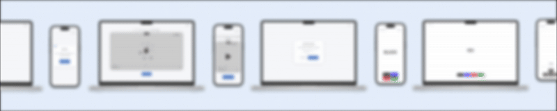
DBFS (Digital Brain Function Screen) is a medical-grade digital cognitive assessment tool used in healthcare settings to detect early signs of brain function decline. It consists of a series of short, game-like tasks and lifestyle questions that patients complete on a computer or tablet, typically in about 15–20 minutes. The test evaluates key cognitive functions – such as memory, attention, and executive function – and provides clinicians with insights into a patient’s cognitive health.

Inputs
The science and clinical teams shared user interview findings and field observations. We learned many patients were overwhelmed by the test’s length and reading level, and some misinterpreted tasks due to unclear instructions. Examples included users tapping on demos and missing when a task actually began.
What we learned
Recurrent pain points clustered around length, literacy, and instruction clarity. We compiled the insights into a report highlighting the most frequent, high-severity issues.


Synthesis
I facilitated affinity mapping to cluster feedback into themes: Duration, Accessibility, Comprehension. From these, we set measurable goals (e.g., reduce time ≥25%).
Decisions
Replaced dense text with visuals/audio cues, clarified transitions between previews and live tasks, and converted themes into clear redesign objectives that formed the roadmap.
Approach
Sketched flows and built low‑fi → interactive prototypes. We iterated through v1 → v2 → v3.
Iteration & testing
At each cycle we ran usability tests with older adults and clinicians, refining instruction screens, transitions (e.g., 3‑2‑1 countdown), and task length. By v3, completion time dropped and clarification questions fell markedly.


Handoff readiness
Produced a design system (type, components, states, contrast rules) and detailed specs for every screen, covering interactions, error states, and responsive behaviors; authored an updated end‑to‑end user flow.
Collaboration & QA
Partnered closely with engineering for implementation reviews and UI QA to ensure fidelity to specs.

Plugg-out

SPCE-Sustainable Packaging Circular Ecosystem

toThere
bottom of page